Branding for The Garrigan Lyman Group

The Garrigan Lyman Group, a mid-sized agency in Seattle, felt it was time to update it’s wordmark and branding. They asked me to develop a new identity that moved them foward without forgetting their heritage.
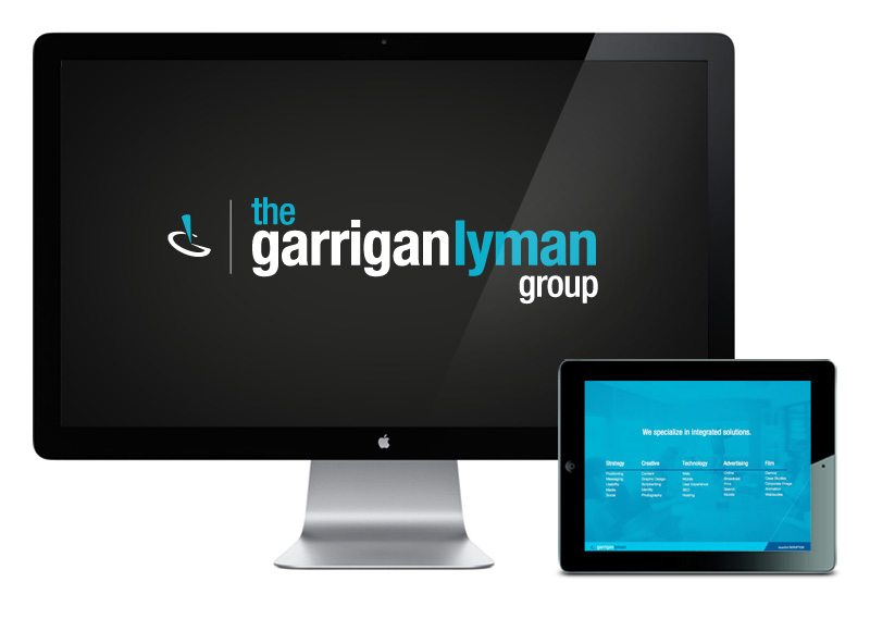
I offered three options and we landed on this contemporary version, which continued to use the original GL icon with a refreshed wordmark.
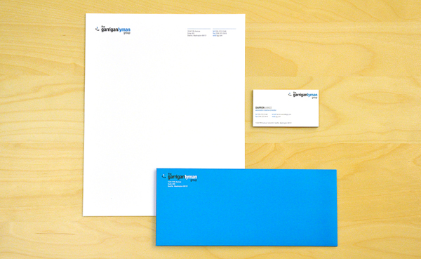
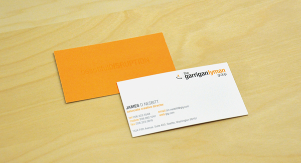
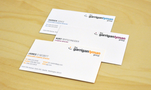
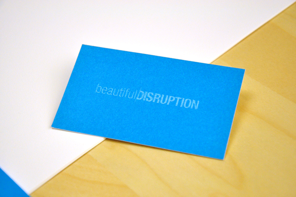
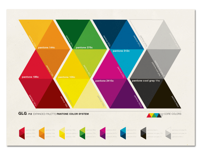
I created a stacked, and longer, horizontal version of the logo for the business to use depending on space, and continued my work in orchestrating the color system and marketing materials to fill out the branding needs. Each employee was provided business cards printed in multiple colors and a blind emboss was added to the back of the cards.

